
Ask Syniad: What Capability Indices Should I Use?
Stop the Cp/Cpk vs Pp/Ppk confusion once and for all! Finally understand these tricky capability indices with simple, real-world examples that actually make sense. No more statistical headaches or guessing games...
STATISTICS
Question: What capability measures should I be using, Cp and Cpk, or Pp and Ppk?
You'd be surprised how often capability indices become the core of a debate. In fact, I see so many companies still getting them mixed up that I found it to be about time to really clarify this. In a way I always like to do it, using silly examples and trying to make it as simple as possible. If you want the short and definitive answer... both should be used. Each set of indices serves a distinct purpose in understanding process behaviour and should be viewed as complementary rather than competing metrics.
Cp/Cpk indices represent process capability - they measure the potential overall performance of a process under stable, controlled conditions. These indices are calculated using short-term variation (typically within subgroup variation) and represent what the process is inherently capable of achieving when operating in statistical control.
To put it simply, it is what you CAN do. Like a chef in a kitchen who is preparing their best plate of food. Cp/Cpk represents them making their dish in their own kitchen with perfect conditions; precise measurements, ideal stove temperature, high-quality ingredients, no distractions, unlimited time. When they follow the recipe and have these conditions, they can make their perfect food most of the time. This shows what they're truly capable of when everything is controlled.
Pp/Ppk indices represent process performance - they measure the current overall performance of a process, incorporating all sources of variation including both common cause and special cause variation over the entire period of data collection. These indices reflect the actual performance the customer experiences.
Back to our chef example, now imagine the same chef working in a busy restaurant over a period of time, sometimes the stove runs hot or cold, ingredients vary in quality, they're rushing during dinner rush, new staff members help with prep, suppliers deliver late. Their actual perfect food success drops significantly. At times, the chef was absolutely able to recreate their perfect dish, but with all of the noise that happened along the way, this got disrupted at times. This reflects real-world restaurant conditions, with all the noise included. This is showing what you are currently delivering to your customer at the end of the service.
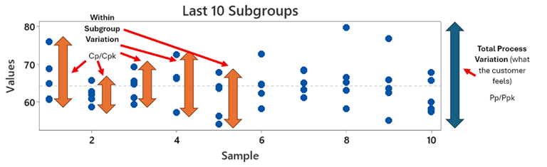
This visual shows is a dot plot of individual data points across 10 subgroups of data. Each blue dot represents the individual measurement, and each subgroup has 5 measurements in them.
The Fundamental Difference
To demonstrate. here is an example of a data set whereby I have simulated 10 subgroups of data where the overall variation and within subgroup variation is fairly similar. This is basically our chef in their controlled environment, with less distractions but some natural variation as they make dish after dish:

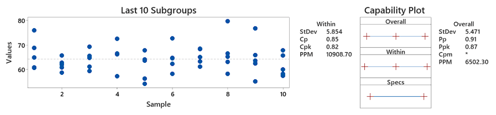
As you can see, the Cp (0.85) and Pp (0.91) and Cpk (0.82) and Ppk (0.87) are not far apart. This effectively shows that the variation you are seeing in each subgroup, is effectively representative of what the customer feels at the end of the day. There doesn’t seem to be noise occurring between subgroups and hence your process may be stable. You can visually see this by the fact that the spread of individual values in each subgroup is fairly similar across all 10 subgroups. If you imagine these 10 subgroups as 10 different operators running a process, it effectively means the variation of each operator is similar, not much is changing between them.
Now here is the exact same data set, but I have simply ordered it to simulate within subgroup variation. Basically I have put the chef into their noisy work kitchen now and asked them to do the same dishes as before:

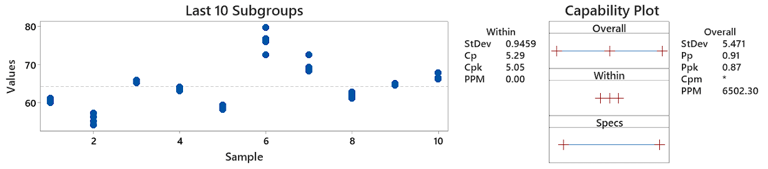
As you can see, the Pp and Ppk are exactly the same as before, because it is the same data, and regardless as to what happens with each subgroup, the customer still feels the same level of quality at the end of the day. In subgroup 1, our chef was pretty consistent making his 5 dishes. But then when he went to make the next 5, there was some disruption which shifted his 'capability' down slightly, and caused a bit more variation. Then by the 3rd set of dishes, he was really consistent again - maybe that noise disappeared?
You can now also see the Cp (5.29) and Cpk (5.05) have shot up suddenly (whereas before they were 0.85 and 0.82). This is because whilst the same quality is being delivered to customer at the end, each subgroup seems to be performing different to one another, and hence the variation in quality is coming from what is changing between each subgroup.
If you imagine these 10 subgroups as 10 different operators in a workshop in more realistic terms, it effectively means the variation of each operator is very different, and theoretically we can see operator 1 (subgroup 1) had very little variation in comparison to some of the others, why can we not do this all the time with every operator? Surely this is what we are potentially capable of if we uncovered the reason why there is so much variation when we move to a new subgroup.
This is the reason why your Cp/Cpk are so high, it is saying if you deal with all of this potential noise, you should f ind your Pp/Ppk start climbing to match your Cp/Cpk. You stabilise your process and have more consistent operation.
There are various reasons why this confusion has occurred over time. Part due to official manuals moving the goalposts on what and what not to use, and others part to misunderstandings being disseminated across various literature and in application in the workplace. Eventually I believe people got confused by it all and decided to either forget using capability indices at all or to just use 1 or the other. A common problem I see is many who report Cp/Cpk thinking it is showing what Pp/Ppk is actually showing - your overall performance.
There is also some guidance in the Automotive Industry Action Group (AIAG) Statistical Process Control manual that has caused some more recent confusion, but when you look at it, it offers useful guidance on this, and where much of the debate comes from is misunderstanding what both together indicate:
"The key to effective use of any process measure continues to be the level of understanding of what the measure truly represents. Those in the statistical community who generally oppose how Cpk indices are being used, are quick to point out that few 'real world' processes completely satisfy all of the conditions, assumptions, and parameters within which Cpk has been developed (see Gunter, B. (1989) and Herman, J. T. (1989)).
It is the position of this manual that, even when all conditions are met, it is difficult to assess or truly understand a process on the basis of a single index or ratio number... No single index or ratio should be used to describe a process. It is strongly recommended that all four indices (Cp, Cpk and Pp, Ppk) be calculated on the same data set. The comparison of the indices among themselves can provide insight to potential process issues and aid in measuring and prioritizing improvement over time. For example, low Cp, Cpk values may indicate within subgroup variability issues, whereas low Pp, Ppk may imply overall variability issues." [1]
This is often the reason why some would say Pp/Ppk are typically or more extensively reported. However I believe this is covering up effective use of the two. The manual is offering correct guidance, just I believe a “playing it safe” approach to prevent people reporting Cp/Cpk when they don’t understand the underlying assumptions and generally speaking, I agree that reporting basic facts is better than reporting misunderstood statistics.
Why the confusion then?
A significant issue with relying solely on Cp/Cpk indices is that they are often misunderstood or misrepresented as Pp/Ppk without practitioners realising the distinction. The fundamental assumptions underlying Cp/Cpk calculations are often overlooked, often including:
Process stability (statistical control)
Normal distribution of data (parametric) - and contrary to what many practitioners may say, 'normal' is not the only distribution we use!
Rational subgrouping
Independence of observations
Appropriate sampling methodology
Perfect "normality" is seen rarely in real-world processes, yet Cp/Cpk calculations as we use them assume normal distribution by statistical theory. When these assumptions are violated, the indices can provide misleading information about process capability. Additionally, when processes are unstable and shift or drift over time, "you will find Ppk << Cpk", indicating a significant gap between potential and actual performance that would be missed if only single capability indices were used.
You're likely to see these gaps also identified as unnatural variation if you use a control chart too - deal with the unnatural variation, you likely deal with the within subgroup noise:
The Problem with Using Single-Indices


The recommended approach from us, is to report all four indices (Cp, Cpk, Pp, Ppk), which then provides several advantages:
Diagnostic Power: Comparing capability and performance indices reveals different types of process issues. Low Cp/Cpk values typically indicate within-subgroup variability problems, while low Pp/Ppk values suggest overall variability issues including process shifts, drifts, or other special causes.
Process Improvement Prioritisation: The gap between capability and performance indices helps prioritise improvement efforts. A large difference suggests focusing on process stability and control, while similar values indicate the need to address fundamental process variation.
Customer Perspective: Performance indices (Pp/Ppk) reflect what the customer actually receives, while capability indices (Cp/Cpk) show the process potential under more ideal conditions.
Comprehensive Process Understanding: Using all four indices provides a more complete picture of process behaviour, avoiding the limitations inherent in any single measure.
Keep it simple: If in doubt, forget the capability measure and just look at the graphical summary! There is a reason why we present things graphically. Statistics should never override pragmatic and factual understanding. If you can see the chef is struggling, there is your evidence before you start trying to use capability measures to prove they are running round like a headless chicken.
The statistical literature consistently supports this multi-index approach. Porter and Oakland (1991) [2] emphasised that process capability assessment requires understanding both short-term and long-term variation, while Kotz and Johnson (1993) [3] demonstrated the limitations of single-index approaches in their comprehensive review of process capability indices. In conclusion, effective process management requires the disciplined use of both capability and performance measures, with clear understanding of what each represents and how they complement each other in providing actionable insights for process improvement and control.
Our Recommendation
"Oh, people can come up with statistics to prove anything, Kent. 40% of all people know that."
Homer Simpson
Daimlerchrysler, Ford Motor Company and General Motors Corporation (2005). Statistical process control (SPC) : reference manual. Detroit, Mich.: Daimlerchrysler Corp.
Porter, L.J. and Oakland, J.S. (1991). Process capability indices—an overview of theory and practice. Quality and Reliability Engineering International, 7(6), pp.437–448. doi:https://doi.org/10.1002/qre.4680070602.
Kotz, S. and Johnson, N.L. (2017). Process Capability Indices. Chapman and Hall/CRC. doi:https://doi.org/10.1201/9780203741948.
References
Syniad CI Ltd.
VAT Registered in UK.
Registered: 11329238
Contact Us
enquiries@syniad.uk
+44 292 277 2786
Our Trusted Collaborators